Forum Replies Created
-
in reply to: Update Specular from v1.2.5
Already tried that and got exactly the same result.
in reply to: Update Specular from v1.2.5<p class=”MsoNormal”><span style=”mso-fareast-font-family: ‘Times New Roman’;”>Already tried that and it unfortunately broke my site (footer content gone, menu merged with header slider on home page etc. etc. I’ve reverted back to earlier version for now until I can find a way to upgrade safely. Any more thoughts?</span></p>
in reply to: Mobile Display IssuesSorry but I don’t know what you mean.
in reply to: Mobile Display IssuesOk, many thanks, will do but it will take a day or two before I can borrow a friends iPad to check.
Did you see the issue on your iPad and if so, has that issue now gone?
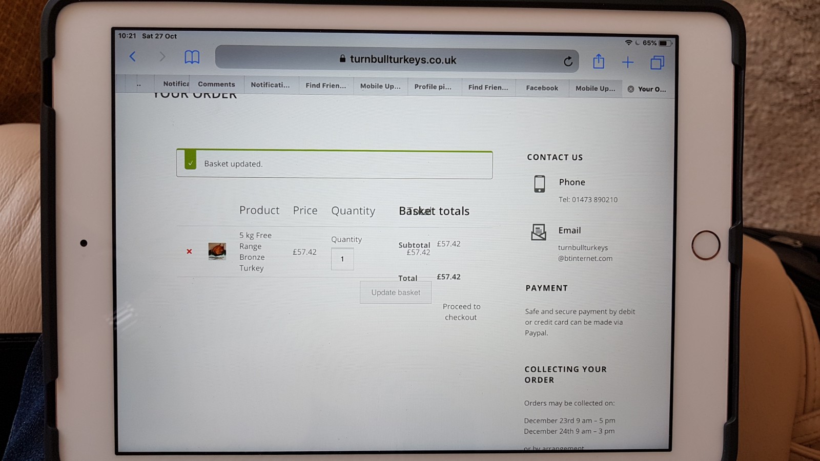
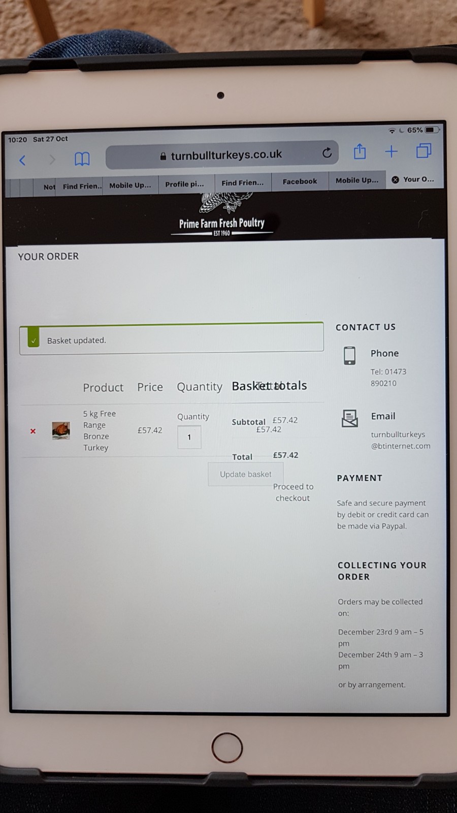
in reply to: Mobile Display IssuesThis reply has been marked as private.in reply to: Mobile Display IssuesJust looked at the online shop on a new iPad after adding a product and there is a bit of an issue with merging of buttons and text as you can see from the attached photos.
https://www.turnbullturkeys.co.uk/wp-content/uploads/2018/10/20181027_102121.jpg
https://www.turnbullturkeys.co.uk/wp-content/uploads/2018/10/20181027_102048.jpg
Let me know if you need admin access to the site again as I’ve now made the site live at the above url so I’ll need to give you new login details.
in reply to: Mobile Display IssuesOk, thanks. I found out today that my client is looking at the website on an old iPad running iOS 10 and it is too old to be updated! This must be the reason for the problems they have when looking at the shopping cart.
in reply to: Mobile Display IssuesExcellent. Thank worked. Many thanks.
I’m trying to find someone with an iPad so that I can test the function of the checkout so that I can prove to my client that the checkout page does not look jumbled as she is still saying!
Which type of iPad did you test the page on please?
in reply to: Mobile Display IssuesThe layout as it is at the moment is ok with Menu on the left of the logo and the cart on the right of the logo. At the moment, when you view the website in portrait mode on a mobile phone these three items are in the right positions but all three are a bit too far to the left whereas they should all be centralised. We don’t want to change the positions of each item just make all three central when you look at the site.
Thanks for the title advice – I’ll make the change.
I’ve cleared the cache in WordPress. I’m not sure how to do a hard refresh on iPad but will investigate to find out how. I’ll see how it looks once we’ve sorted the refresh.
in reply to: Mobile Display IssuesOk, many thanks for doing that for me. The logo is now larger but the three icons (menu – logo- cart) that appear at the top of the page when viewing the site on a mobile in portrait view are not quite central and and are positioned more to the left. Is there a way to make them appear central?
Also, the title of the home page is still missing the last word ‘Poultry’ when viewing on mobile in portrait view.
My client is still saying that the following is still a problem on her iPad (landscape or portrait view):
”
<span style=”color: #4b4d4d; font-family: Raleway; font-size: 14px;”>iPad / Tablet Portrait View – If I add a product to the cart from the Online Shop page, the resulting page does not look good – the text and buttons are merging in to each other. Also, the email address at the bottom merges in to the next footer column. How can I fix this please?</span>”
Everything looks great on other devices, it’s just an issue on iPads now.
in reply to: Mobile Display IssuesI also mentioned earlier one other small issue when looking at the website on mobile in portrait view and that is on the home page the title is not displayed completely – the last word ‘Poultry’s is missing. It’s there in landscape but missing in portrait. Is this something we can resolve?
in reply to: Menu Display in mobileOK no problem. I’ll see if I can find a way around it.
in reply to: Mobile Display IssuesI’ve added the above code but the logo size is still the same despite increasing the height – it always looked ok in landscape mobile and tablet view but the problem is when looking at it in portrait view on mobile – it’s still very small.
I’ve also added the other code and a space to the email address and asked a colleague to check the site on their iPad and iPhone.
Thanks again for your advice and guidance.
in reply to: Mobile Display IssuesThank you. That’s looking better. With this code can I adjust it to make the logo slightly bigger?
iPad / Tablet Portrait View – If I add a product to the cart from the Online Shop page, the resulting page does not look good – the text and buttons are merging in to each other. Also, the email address at the bottom merges in to the next footer column. How can I fix this please?
Thank you for your superb help and assistance so far and sorry for all the questions. We are about to launch this site at the weekend to start selling turkeys and chickens etc. for the forthcoming Christmas period so are keen to make everything look OK for our customers. The theme is looking really nice on our site so we just have a few little bits to sort and we should be ready.
in reply to: Mobile Display IssuesThank you for doing that. I just checked on my Samsung Galaxy S7 Edge and in portrait view the logo now appears underneath the 3 lines on the left that you click to see the menu.