-
My site is ohiotaxattorney.com – I can’t seem to get the mobile menu to show up for the life of me. Please help!
Topic: Missing Mobile Menu
I am not seeing my mobile menu when viewing on mobile devices. How can this be fixed?
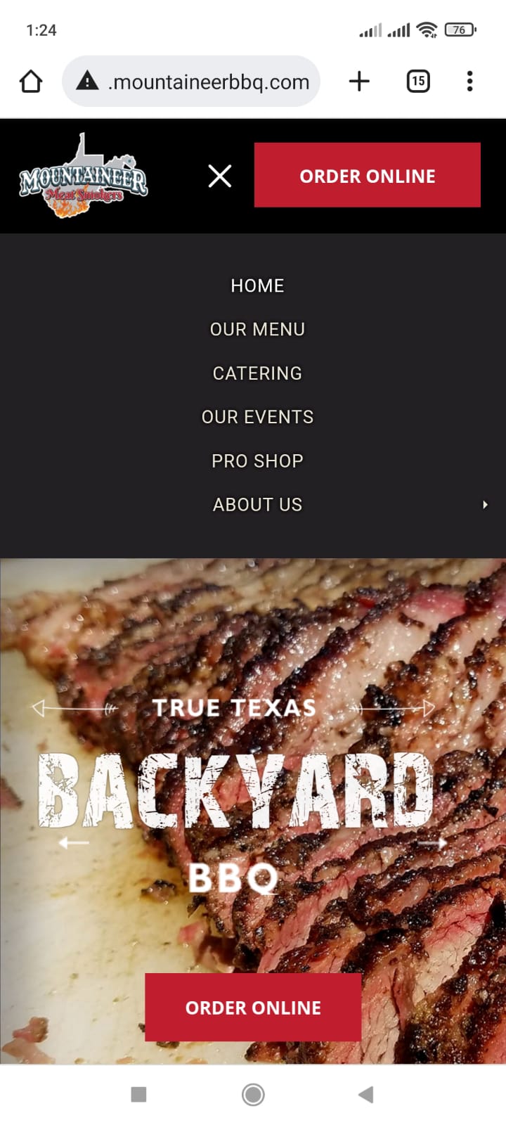
when i didn’t switch on the hamburger menu, the menu shows correctly on the desktop page, but on the mobile browser, it shows only black screen.. i.e. black background and black text.. if i click on the correct location, the page open.
but when i change the setting to full page, i.e. the menu only shown as 3 lines on both desktop and mobile, with full page, it works on both platform. same problem with half page menu.. only desktop works and mobile is black on black.. is this a configuration change?
I have tried all background and font colour change.. didn’t makes any difference.
Hello, please tell me how to fix, my website has TOP MENU , on mobile version, its not working . the TOP level links
so I have ,
FOOD this link not working only open the dropdown
/ food
/ food 2
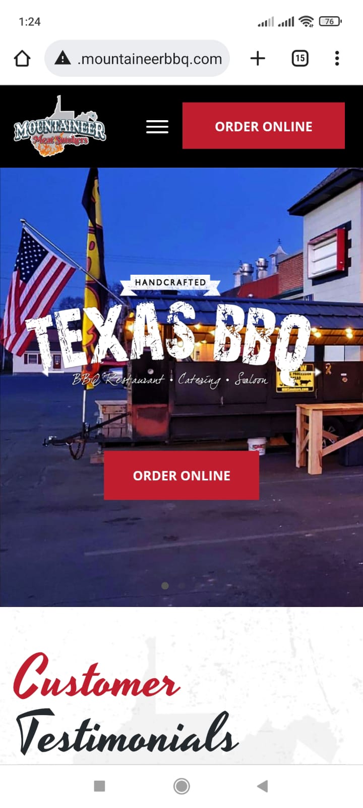
Mine on mobile has the logo at the top and the menu icon below it to the right . . . I’m trying to get it to look like the menu in that link I just sent you.
Hi,
Sorry, Please explain in details.
btw Mobile Menu is visible now.
Thanks,
Well, Mobile menu is Back.
See and let me know.
Thanks,
My site is ohiotaxattorney.com – I can’t seem to get the mobile menu to show up for the life of me. Please help!
I finally found through a 3rd party website where to turn the mobile menu on and neglected to update the ticket. Not sure why that would be turned off by default?
Hi,
I can see the Mobile Menu:


Thanks,
I am not seeing my mobile menu when viewing on mobile devices. How can this be fixed?
