-
-
Hi there. When viewing the ‘client’ logo carousel in responsive view from a mobile device/phone the logos are not centred but are positioned to the right. They are perfectly aligned when viewing from desktop or larger devices. The client cannot get past this. Can you please let em know a fix we can implement. Please see screen shot:


The website home page has the client carousel: https://staging.compasspm.com.au
-
-
You’re welcome :)
If you like our theme and support, please leave us a rating on Themeforest, it’s very important for us :)
https://themeforest.net/downloads
Thank You so much!
-
I have another issue now I’m hoping you can help me with Mirela. In responsive/mobile view I’m still seeing the page breadcrumbs in the header (which usually ins’t there) and the page title info isn’t justified to the centre of the row (vertically). See screen shot.
Also how do I get the logo to sit more to the centre rather than the right?
Thanks, Michael


-
To clarify, in mobile/responsive I wish to:
- remove the breadcrumbs
- have the logo centred in the top header area
- have the page title centred (vertically) on the header bar.
Thanks, Mike.
-
Hello,
Please add this code into your Custom Css box:
@media (max-width: 480px){
.header_page.normal .breadcrumbss.normal {
    display: none;
}
.header_page.normal h1 {
    text-align: center;
}
#logo {
    margin: auto 4em !important;
}
}
Result screenshot: https://ibb.co/zZjszSW
Best regards!
-
Unfortunately that affects both desktop and mobile view. I was happy with how it works on desktop, I only wanted to adjust responsive view. In the meantime I have switched off the breadcrumbs. Can you please advise.
-
As an alternative, are we able to swap over the position of the menu and logo in responsive view… so logo is aligned top left and menu/burger aligned top right?
-
Hello,
The
@media (max-width: 480px)rule is for this. It limits the css to be effective only to screens 480px and under. It’s not possible for this to affect the desktop layout. Please add some wp credentials in a private reply, so i can check it directly.Best regards!
-
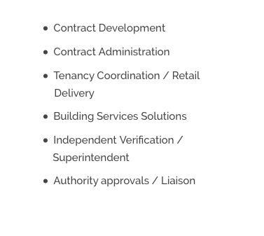
For the time being I have turned breadcrumbs off so lets hold this issue till the new year. In the meantime there is another formatting problem.
When the text wraps on a bullet point the second line doesn’t indent and aligns left, rather than with the text above. See the word ‘Superintendent’: https://www.compasspm.com.au/services/
See screen shot:
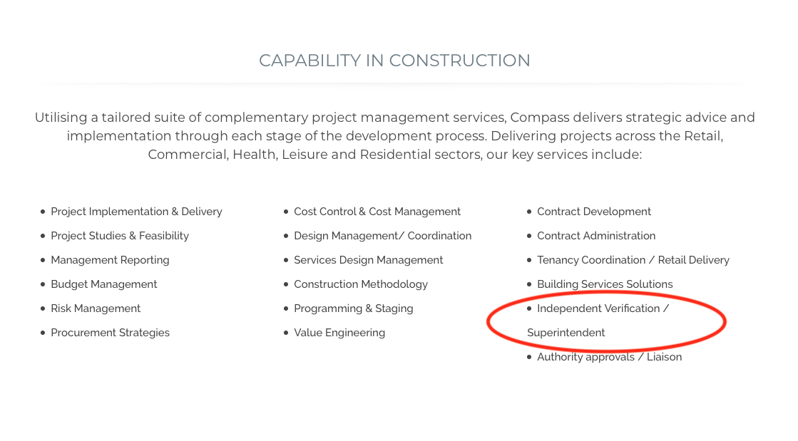

It would be good for the second line to indent and be half the line height compared to the full bullet point right. Please see the below reference/mock-up:

-
This reply was modified 6 years, 6 months ago by
 amccreative.
-
This reply was modified 6 years, 6 months ago by
-
Hello,
You can edit this by adding this css:
@media (max-width: 979px){
 ul li {
     text-indent: -18px !important;
}
}
Result: https://ibb.co/CVW407W
Cahnge the value to your wish.Best regards!
-
-
You’re welcome!
Please take a few seconds to leave us a rating on Themeforest, it’s very important for us :)
https://themeforest.net/downloads
Happy Holidays!
-
You must be logged in to reply to this topic.