-
-
Dear Codeless,
Thank you very much for your great tower theme! Love it!
For my website i’ve imported the masonry portfolio demo https://codeless.co/tower/portfolio/masonry/#
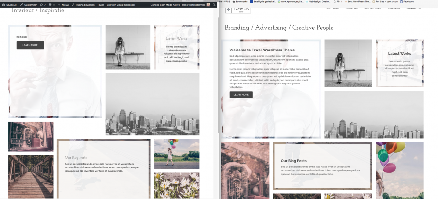
But strangely, in my homepage it’s not exactly the same as the demo. In the demo the space between the blocks is nice and the same. But on my homepage there are holes, it seems like the images on my home are not scaled while it is scaled on the demo homepage.
 Do you have any idea what setting this is?
Many thanks and best wishes
Wietske
-
This topic was modified 8 years, 3 months ago by
wietsketammes.
-
This topic was modified 8 years, 3 months ago by
-
Hello,
Can you please send a link of your site? So we can see better the difference.
Best regards!
-
-
Hello,
I understand you point. The demo home page contains a portfolio element displaying the portfolio items in masonry style. This style randomly orders the portfolio items in a page according to the number of rows you have set up.
This is depended from the featured images sizes as well. The demo is using featured image sizes that when shown up in masonry mode, form that layout. Example:
-demo featured image size: https://postimg.org/image/77zybx1np/
-your post’s featured image size: https://postimg.org/image/5sydn835h/I suggest you start importing your own images and crop them to create the layout you want.
Let us know.Best regards!
-
You must be logged in to reply to this topic.

 Do you have any idea what setting this is?