-
The Specular 2.2 theme caused a critical error on my site, preventing even wp-admin login access. We were able to make a theme change through bluehost support to at least get back to the wp-admin login. Assuming a need to update from 2.2 to 4.0+, we downloaded and then uploaded/installed the Specular 4.0 theme, but the critical error is back. Are there known issues with LayerSlider WP, Visual Composer, Meow Apps, MC4WP, WP Mail SMTP, Mobile Menu Options, or Advanced iFrame? Below is the info that came from the recovery mode email received on the previous critical error (haven’t gotten the recovery mode email on this critical error yet)…
How about with WordPress version 5.8.1
Current theme: Specular (version 2.2)
Current plugin: (version )
PHP version 7.4.24Topic: Mobile menu
Hi, I want to have 4 menu items in each page corner. I have a problem on mobile, because I end up with 4 hamburger manues.
I created a separate menu that I want on mobile that combines all 4 items. How can I set it up?
Thanks for your help
Hey Codeless,
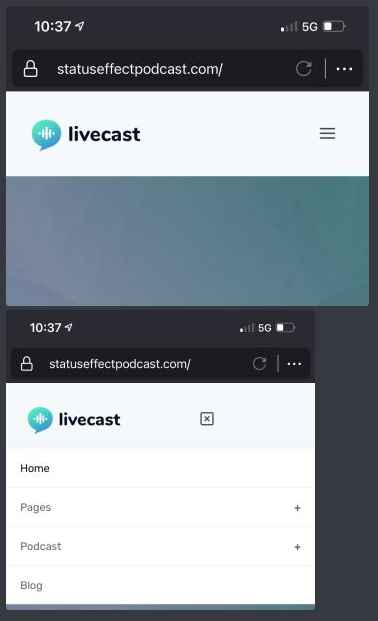
We’ve gone ahead and picked up your wordpress theme recently for our new podcast but need some assistance in setup up the website before we want to go public. I’ll make a list below of things we can’t seem to figure out and need help with. Our site: https://statuseffectpodcast.com
1. Menu Icon on mobile moves to the left when click to view menu.
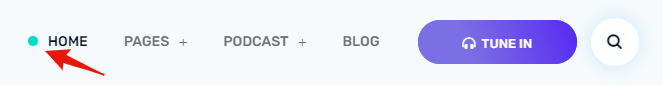
IMG: https://i.gyazo.com/82380f8ae2d528688f5a4eccbf033590.png2. Changing the color of the highlight menu item button on desktop do another color.
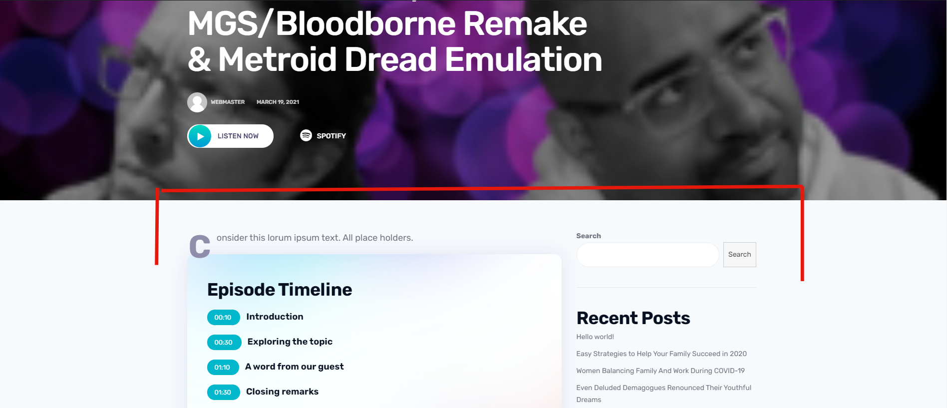
IMG: https://i.gyazo.com/4a79f913a75cf97aa85359475e3d6bb3.png3. Making Dedicated Podcast Episode Pages Full Width.
IMG: https://i.gyazo.com/334a6eeedd795e4396d5af811cfbb9f6.png4. ‘About Us’ page was not imported during install. We would like this page as a template to work with and edit: https://preview.codeless.co/livecast/default/about-us/
We’d also like to know if it would be possible to just have wordpress pull episodes from an RSS feed to play them in the default player similar to this theme: https://themeforest.net/item/roogan-personal-podcast-wordpress-theme/28359815
It also has share buttons etc. right in the player itself. It would very much help to organize the podcast into shows, auto pull episode numbers and more.
Let us start with getting help with these and we can go from there. Please let us know if you need a login / FTP access to get started.
Much appreciated!
Hi Codeless team!
In Internet Explorer in Windows the mobile menu button disappears when its clicked and should transform to a X-icon.
I know that IE is (annoyingly!) not the most supported browser, but can you make a a workaround?Video: https://imgur.com/3MBi8LF