-
Topic: menu not working on mobiles
Hi,
I get an issue on menu on mobiles for this site:
http://www.misanoimmobiliare.it
The menu doesn’t work on mobiles.
I already found this problem in the past and you told me that the problem came from the plugin “estatik”.
Estatik plugin support is telling me this:
“The reason for issue is in your theme. When plugin acts in js $( window ).trigger( ‘resize’ ); the menu stops working. But this line usually doesn’t cause any errors, the code is harmless here. It helps to make the layout responsive. For now this line was deleted in the code, but this is a stopgap measure. And we would recommend you to connect your theme developers with this issue”
Could you please check?
Regards
Marco
Topic: Mobile Menu
Dear team,
My portfolio is lengthy so I would like the menu to become hamburger menu on mobile.
Can you help me with that?
Thank you!
Topic: several issues
First of all, thank you for the great theme. Sadly, my conversion and click through rate dropped significantly after I relaunched my website using the June-Theme. At the moment I’m really burning money.
I will now post all the problems I faced, hoping that you can help. These are too many problems, so I will not open a ticket per problem, please handle this as a master ticket.
I’m convinced, solving this problems will help all your customers, not just me. In my “professional” career I’m Director E-Commerce for wellknown fashion brands which made me win several usability awards, so maybe we can take june to another level together. I will be there for further information or discussions.
Looking forward hearing from you!
Fabs- you cant use the menu on mobile!
If you want to open a secondary link, you need to click on the first level link to open it. if you do so, the link will be opened, instead of showing the 2nd level links. - You should definitely use an offcanvas menu instead of a dropdown on mobile.
It’s more “trendy”, easier to use and better known. If you use an offcanvas, you can put the search and the quicksearch-links in there, too. Would save space and make it more user-friendly. - There should be a chance, i didn’t find, to add a sticky header with a slick line (just logo and navigation.
Currently you can only fix the whole header, so if you use the “thick” version with quicksearch and stuff, this would be to thick to use. - Make scrollable banners
If you add banners (like the 3 on the demo-page below the main-slider) they should be scrollable cards instead of multi-line breakpoints. This is the way the users learned it from facebook and instagram. By the way, it’s taking unnecessary place. One banner, always centered, is full visible, the “next” and “last” banner should be cropped, so it’s directly clear, you can scroll here. - the “Shop Global Single Product Style” in the options doesnt work.
It will always show the default, no matter which setting you use. I wanted to use “wide & vertical thumbs” – if i set it in the single product, it works. if I set it in the customizer it doesn’t. - you should change the way of the filters.
If you use the left / right sidebar, they are “invisible” on mobile (you would have to scroll way too far). If you want to use the inpage filters the link “+filters” is nearly invisible – also there should be an option to open the inpage filter bar on default. Or to make it more visible (just like hugoboss.com) and open them in a modern offcanvas to save space. - whatsapp sharing should be invisible on desktop
Or at least to have an option, which share should be visible on which device - quicksearch should be optimized
you can only use 4-5 Links otherwise it breaks the layout in the header – but if you want to also use the quicklinks in the footer, there need to be more links. Otherwise its not usefull anymore. The Quick-links in the footer should be scrollable instead of multi-line. - also in the webmaster tools – google cant see the mobile version and there are a lot of things to fix.
One more problem, that will only help me when solved, not all your customers:
I have problems with missing images and double price-display when using the “woozone” amazon affiliate plugin. This had been fixed in an earlier version, I’ve been in contact with you guys via skype. Now it appears again. Too bad!
Topic: How do I add youtube videos
Hello,
1. How do I add youtube or vimeo videos on the page?
There is no such option which is showing on home page.
2. How do I hide additional information tab in the product page.
Link: https://www.softags.com/leefilters/product/3126/ (I dont want to show in any product page)
3. Mobile menu is not coming same as desktop menu. How do I set the same in mobile. No such option in appearance -> menu.
4. I want the search bar in the right side and hide the cart icon as I am using as a catalogue.
5. How do I add a mega menu. To be very frank this theme is not feasible to use for a beginner or a intermediate as for everything we have to go to customise and it freezes like hell.
Please add a dummy mega menu under products. I ll change the links.
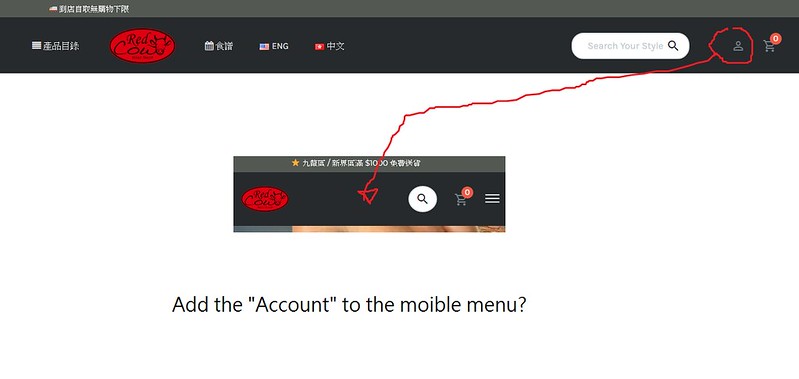
Hi team,
1) I have the “Account Login” on desktop version, while it disappears on mobile. How to show it up on mobile menu?

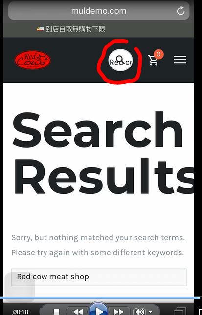
2) Search problem on mobile:
https://flic.kr/p/26KupVP
2A) the search bar is overlapped on the cart icon. it will only be closed until i click the menu button. Can i make it closed when i press it (the icon or else)?
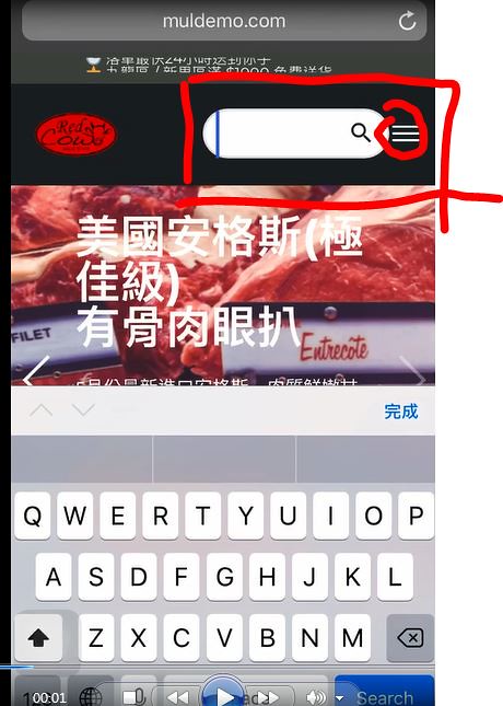

2B) Can i remove the search text in the icon?

THANKS!
- you cant use the menu on mobile!