-
Topic: Mobile issues
Hi
I just updated from an old version of Tower theme and several items are not working on my site:
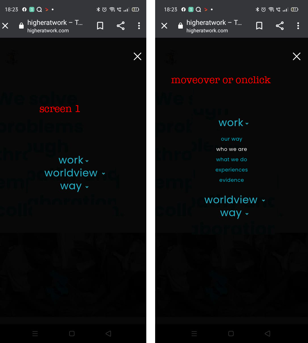
1. Codeless slider on homepage is working fine on desktop, not at all on mobile. How do I fix this?
2. Hamburger menu does not work at all on mobile. How do I fix this?
3. How do I remove breadcrumbs…I don’t want breadcrumbs on any page. I was able to remove them from Firefox in custom css box by changing from .breadcrumbss.full_bar {display:none;} to .breadcrumbss {display:none;} Please advise how to permanently remove breadcrumbs from entire site. I also tried the settings in Tower > Header Options > Default Page Header but changing the “page header style” and “breadcrumbs style” did nothing.
4. The page header has a different height depending on the browser. Firefox has the height that I want. Chrome and Safari are displaying it with less height. Why? Again I went to Tower > Header Options > Default Page Header and changed Page Header Height from 80px to 160px to see what would happen. Nothing happened. Please advise how to change this.
Hi,
I am creating a website using the Tower theme and have some issues, most important one: the hamburger menu is not showing on mobile and tablet.
The icon is just not there so you cannot enter the menu.I can give you access if you want to investigate.
Website is not live yet.Kind regards,
An
Topic: problem with mobile menu
Hello,
I have a problem with the menu mobile, when I click on the menu on my phone, it appears blank and the categories do not show up.
Can you please tell me how to fix my problem?you can check from your phone
Thank you in advance.Topic: Several Issues Happening
Hey Team – thanks in advance for any help in getting this in order!
First, I’m not a developer or anything, I just know enough about websites and html to be dangerous (and asked by friends to make their websites), so I’m sure there’s some sort of user error in there someplace. Please be gentle but direct with critiques! I’ve never used Specular before but my friend liked the look of it so we went with it.
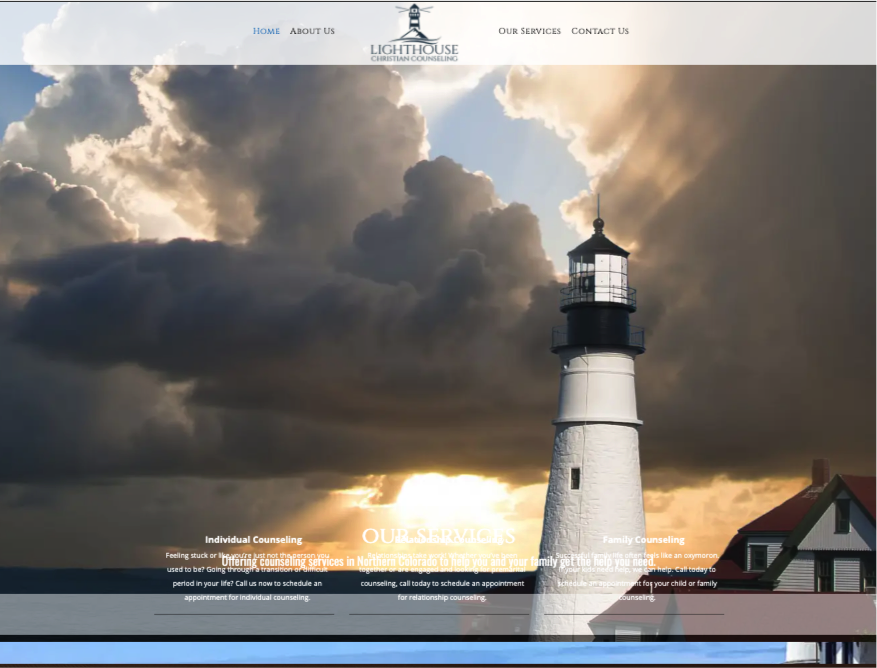
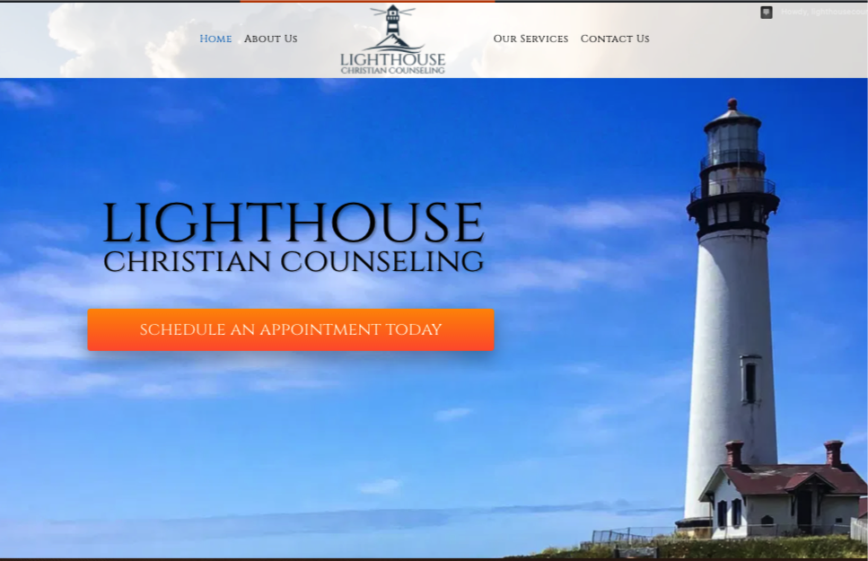
1. Revolution slider and entire page appears to work perfectly when i preview the homepage in a chrome window that has a tab that is also logged into the wp-admin. However, when I go to incognito, the slider is gone and all the formatting for that page has gone to pot.
Looks like: https://madshot.net/bfc0d64c1381.png instead of https://madshot.net/dab3a2cb3c84.png
It was working perfectly prior to enabling the SSL, but I haven’t deactivated the SSL for fear the obvious reasons.
I’ve tried deactivating/activating the plugins, have tried a couple of other little tricks I’ve found online, but nothing seems to help.
I had initially short-coded the slider code on the top of the page, then also tried to add it in using the footer options. Homepage currently has the shortcode in the body of the page.
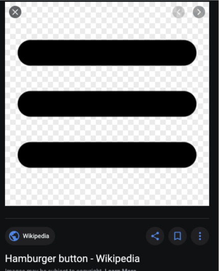
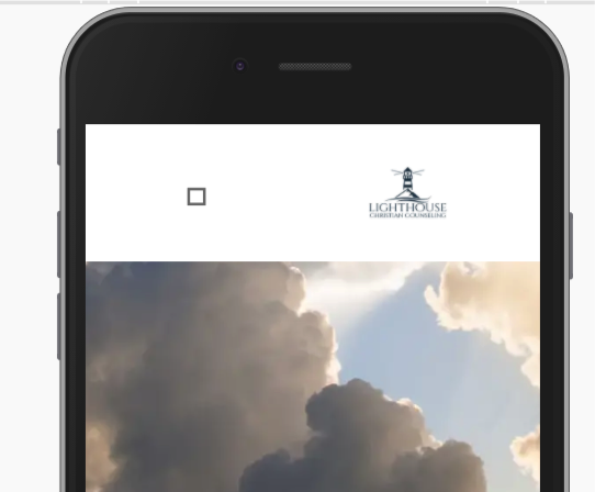
2. Mobile menu icon is a square (not hamburger) and menu doesn’t open – the mobile header is fine, logo looks ok, but instead of the classic https://madshot.net/a8d08b909832.png it looks like a square and doesn’t do anything: https://madshot.net/5f288f6898ae.png
Of course the whole mobile look is shite right now anyway, but we’ll get it figured out.
THANK YOU again for any help and ideas in making this work! I’m sure it’s so simple yet I’m pulling my hair out.
-Jeff


